Executive View
This page describes the Executive View tab — the main financial overview screen in AI/R Watch.
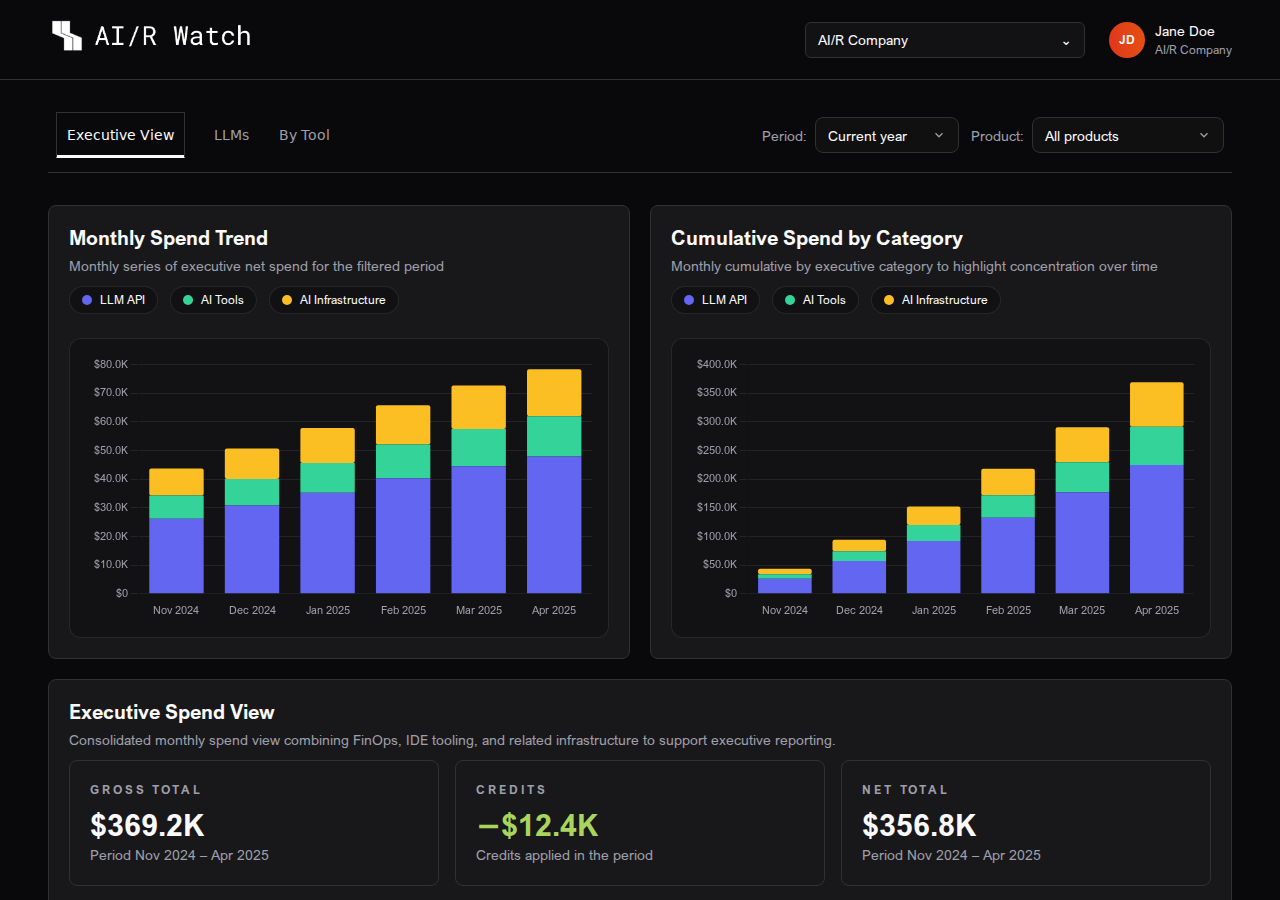
The Executive View is the default tab when you open AI/R Watch. It provides a consolidated financial overview of AI-related spending across the selected organization, combining tool costs, language model API usage, and related infrastructure into a single screen.
Period Selector
All data in the Executive View is filtered by the selected time period. The period selector is located at the top of the dashboard, to the right of the tab navigation.
| Option | Description |
|---|---|
| Current month | Data for the current calendar month |
| Previous month | Data for the previous calendar month |
| 3 months | Rolling 3-month window |
| Current year | Year-to-date data |
| Custom | Select a specific start and end month |
AI Only Filter
The AI Only toggle (visible in the Executive View tab) restricts the data to AI-specific categories: LLM API, AI Tools, and AI Infrastructure. When disabled, all cloud spend categories are included.
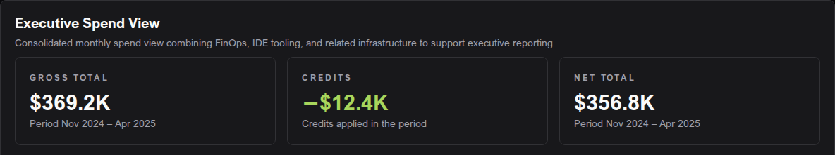
KPI Cards
The summary cards at the top of the Executive View provide a quick read of the financial position for the selected period:
| Card | Description |
|---|---|
| Gross Total | Total spend before credits, for the selected period |
| Credits | Credits applied against the gross total |
| Net Total | Gross spend minus credits |
| YTD Net Total | Net total from the start of the year to the current month (visible in year-to-date mode) |
| Annual Projection | Current month spend annualized as a full-year estimate |
| Leading Tool | The tool with the highest net spend in the period |
Spend Trend Charts
Two stacked bar charts provide a visual breakdown of spend over time:
- Monthly Spend Trend — shows the net spend per category for each month in the selected period. Each bar is divided by category, making it easy to see which categories are growing or shrinking.
- Cumulative Spend by Category — shows the running total of spend per category across the period. This highlights concentration and helps identify which categories dominate the overall budget.
When the current month is not yet complete, AI/R Watch displays a projected value for that month based on historical trends. Projected months are indicated with a ~ prefix in charts and tables.
Category Distribution
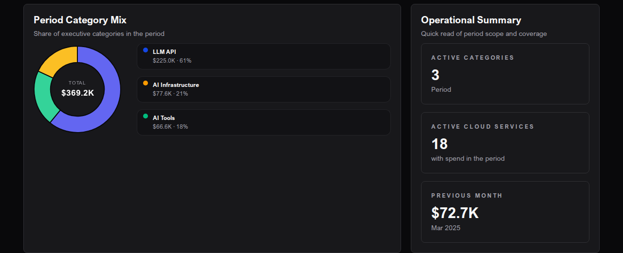
The Period Category Mix donut chart shows the share of each executive category in the total spend for the selected period. Hovering over a segment displays the category name and its absolute value.
The Operational Summary panel alongside the chart shows:
- Active categories — number of distinct spend categories in the period
- Active cloud services — number of distinct tools or services with recorded spend
- Previous month — total spend for the month immediately before the selected period
AI Executive Summary
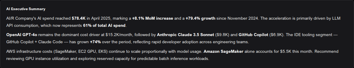
The AI Executive Summary card generates a narrative analysis of the current period's data. It summarizes key trends, highlights the leading categories and tools, and flags notable changes compared to the previous period.
- Click Regenerate to request a new summary based on the current data.
- The summary is generated on demand and may take a few seconds to appear.
The AI Executive Summary is generated automatically from the financial data visible in the dashboard. It does not have access to information outside the selected period.
Top Tools in Period
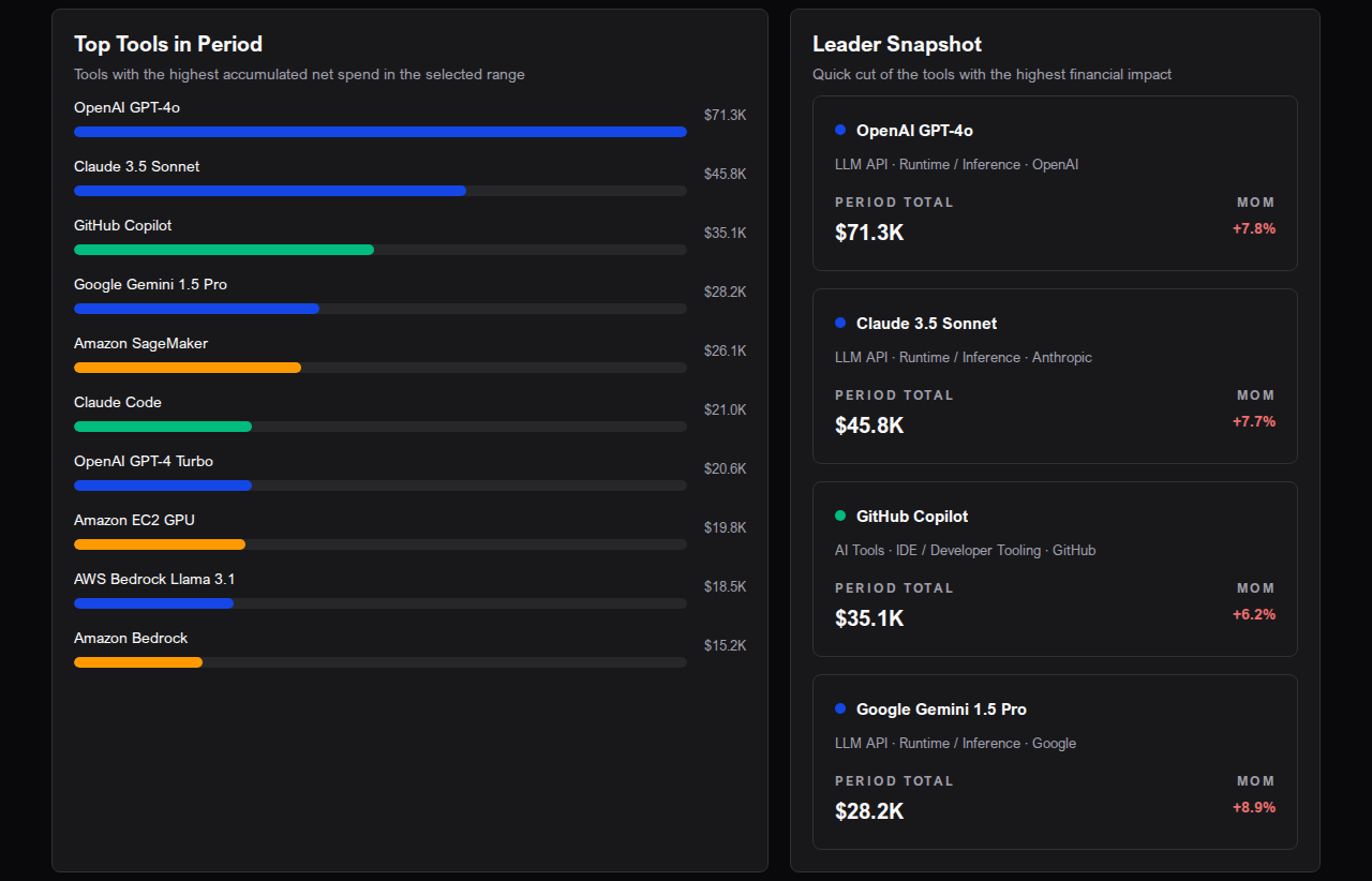
The Top Tools in Period section shows the tools with the highest accumulated net spend in the selected range.
Bar Chart
A horizontal bar chart ranks the top tools by total net spend. Each bar is color-coded by executive category, making it easy to identify whether the leading costs come from LLM APIs, AI Tools, or infrastructure.
Leader Snapshot
The Leader Snapshot panel shows cards for the top four tools, each displaying:
- Tool name and category
- Total spend for the period
- Month-over-month (MoM) change
Tool Detail Table
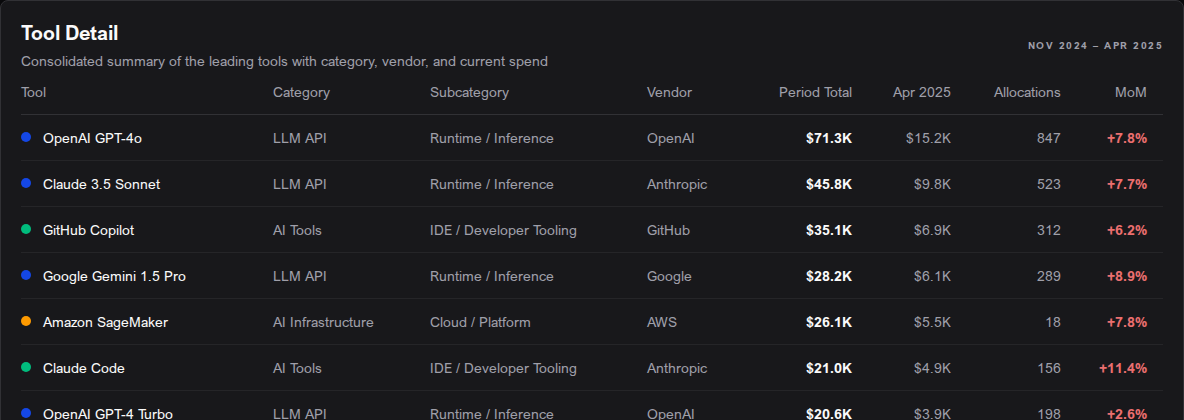
The Tool Detail table provides a full breakdown of the top tools with the following columns:
| Column | Description |
|---|---|
| Tool | Tool or service name |
| Category | Executive category (e.g., LLM API, AI Tools) |
| Subcategory | Subcategory within the executive category |
| Vendor | The vendor or provider of the tool |
| Period Total | Net spend accumulated across the selected period |
| Current Month Cost | Net spend for the current or most recent month (projected if the month is incomplete) |
| Allocations | Number of allocation records in the period |
| MoM | Month-over-month percentage change, color-coded (green = decrease, red = increase) |
On mobile, the table is replaced by expandable cards with the same information.
Next Steps
To drill into language model API costs by cloud and model, go to LLM Usage. For a product-level breakdown, see Cost by Tool.